My two main inspirations for my hot dog fold booklet came in the way of typography. I had experimented in various different styles, but was nervous about the audience I was addressing- either giving the appearance of too masculine, or too feminine an audience. I wanted something strong and classic, not too soft, and not too strong.
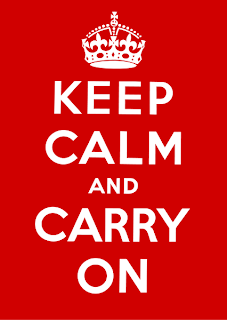
I looked at classic uses of typography and graphic design, and started to look at wartime and propaganda imagery.
I have always been a fan of the 'keep calm' posters, and after a little research discovered that the type, a hand drawn specifically designed style, could be emulated closely by several existing fonts in the adobe library- and, in particular, Gill Sans, which I went on to use through my images, and was very pleased with the similarities, and the same boldness it created.
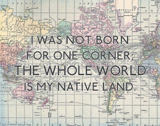
I was fortunate enough to have been linked to this image, quite by chance, by a friend who knew a little about the project, and I felt instantly inspired- maps, Gill Sans, text- everything that I hoped to achieve in my designs. The main source of inspiration was the white outline around the black text, which really helps to highlight the lettering and bring it forward from the background images- a style which I have gone on to use in my final design.


No comments:
Post a Comment