

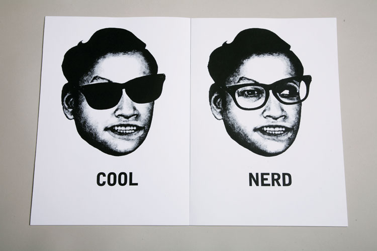
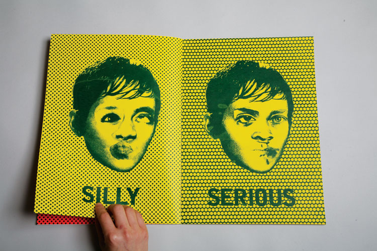
A really cool silk screen book of opposites in portraiture by Sunny Hwang- with a collage technique, she arranges images that are very similar, but with completely contrasting meanings.
Fun idea, but too image based for my intent for this project- however, I really like the use of pattern on some of her pages- a definate consideration in my designs.

A beautiful set of twelve monchrome books by Pentagram- based upon antigrams, a rare form of anagram whereupon rearranging a word can create a new word with an opposite meaning.
I really love these designs- simple, bold and well-suited use of black and white, enhancing, and not detracting from the content.
What I like most about this series in the concept behind it- I believe I am a very conceptual designer, and I certainly believe that half the success is in the idea behind the type and/or image.

Interesting concept by Bryce Gardner, illustrating two opposites that without one another, in context, do not visually communicate a particular message. Clever idea- Bryce here using flowers and bombs.
Perhaps for my own idea, using this sort of representation within type as image?

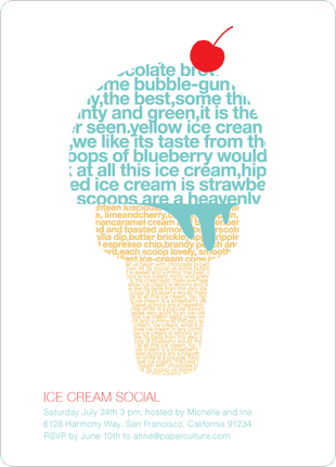
Not really a fan of the uses of font here, but I really love the way that both the shape and the colours so strongly represent an ice cream- clear, bold and distinct.
I also really like the use of poetry- again, with a love of wordplay, this is definately an avenue I will explore within my designs.
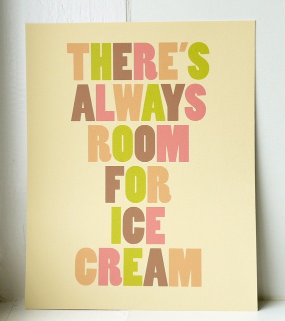
More ice cream examples- good use of soft, pastel colours here- a real 1950's Americana vibe- instantly makes me think of knickerbocker glories and sweeties- the use of colour here really sets a mood and character for the image (built up of type) here brilliantly.

I really love this design- so simple but a really strong piece- candy colours, so sweet and innocent really represent the youth and child-like playfullness associated with ice cream- also, great stock, the light caramel ensuring the colours stay soft and pastel like (they may look a bit too harsh and bright against a white background, for instance).

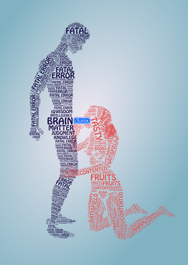
...And now for something a bit different! Great use of type- really funny, humourous use of wording and great shape to the lettering- a really clear image and great example how such a regular action or image can be transformed into something witty and innovative using type.


I love these incredibly detailed sketches of type- "the anatomy of type"- constructed through illustrations of bones- a great concept which translates wonderfully into these skillfully designed posters.
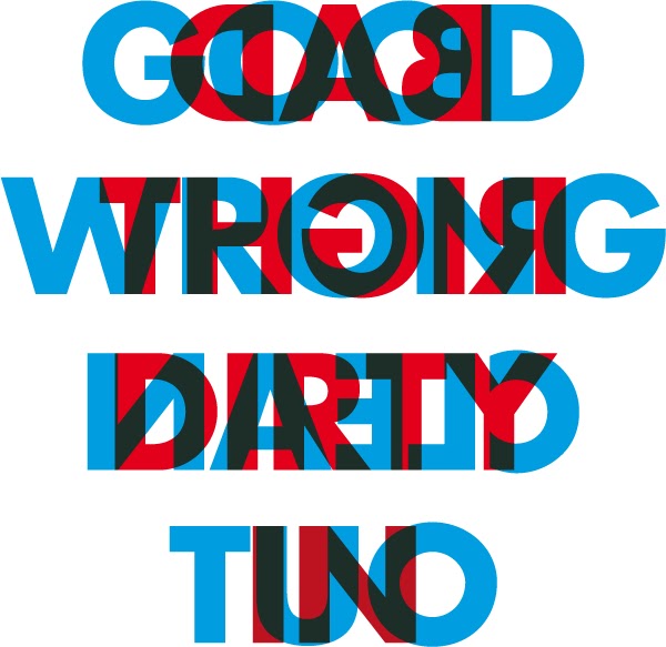
I really like this idea- a bit like some of the ideas that I started "doodling" down- but better (naturally...). I really like the use of blue and red together- connoting the magnatism effect of "opposites attract" aswell as a 3D-like effect, where both of the colours are fighting to stand out of the page/monitor. It doesn't do much for getting rid of a headache, but it's certainly bold!


There are two factors I really like about these two laser-cut typographic necklasses:
1. how effortlessly the type is combined with the image to make a bold and elegant piece- a similar design I had in mind for my own outcomes and
2. the application of the type- although I have initially considered using simple illustrator and design software to create my posters, I can also use photography as a medium, therefore, time provided, could experiment with more lavish 3D designs.
There's such a fantastic range of design ideas out there, in relation to opposites, that I now really look forward to experimenting in the development of my own designs, and am anticipating the week ahead, as I feel that my confidence and ability strengthens every project.
No comments:
Post a Comment