Thursday 31 March 2011

What Is Graphic Design For?: Type and Image- Pillows.


A brilliant video created by Chris Crutchfield showcasing Los Angeles' worldwide pillow fight day on April 3, 2010.

The video was shot on a Canon T2i with an 18-55mm standard lens, with audio captured using Zoom H4N- with post production, and music added in Final Cut Studio and After Effects- music "Finally Moving remix" by PrettyLights.
The bulk of the video was shot in 1080/24p with slow motion sequences shot in 720/60p.

I was delighted when I first saw this video- so vibrant, energetic and playful, it would make a wonderful televised commercial with great application of type and graphic design at the beginning and end of the video- simple, yet bold and effective.

A brilliant concept and seemingly flawless execution- the video is crisp and exhues fun, playfullness and life- all the aspects of graphic design I aspire to excorcise and experiment with in my own practice.

What Is Graphic Design For?: Type and Image- Google Homepage; Robert Bunsen.


The brilliant Google homepage for today- the birthday of Robert Bunsen, revered German chemist of whom the bunsen burner was named.

I'm a big fan of Google, the company, and search-engine single-handidly increasing my IQ threefold in the past five years or so (probably)- and one of it's main attractions are the creative and playful header bars they make on "special occasions"- and this animated design is no exception- a great treat, make sure you see it before the day is out if you can!

This playful, scientifically-themed design really reminds me of my favourite design branding, for Swiss pharmacutical company, Geigly- using bold, geometric printed style which I really respond positively to- bold, bright and eye-catching design- it's great to see a translation on this style in screen format, and I believe this works just as effectively as the traditional print stylings of Geigly.

Google have certainly opened up an even greater and traffic of their website through this tradition of gadgetry banners- creating online fascination, linking through social networks and increased hits- a great design strategy, which also helps people to learn or discover more about social history. 

Just great design.

What Is Graphic Design For?: Type and Image- Charlotte Delarue.

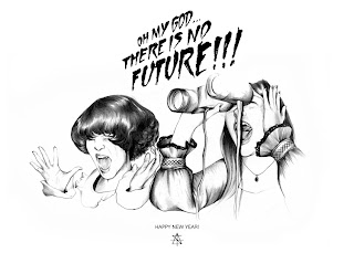
 A one-time pencil-o-holic, I was really drawn to this tonal design by French artist and illustrator,
Charlotte Delarue.

Like many of Charlotte's designs, 'No Future', created for 'Surface to Air' http://www.surfacetoair.com/

("boutique and creative studio" website brand) is creative, masterfully drawn with complete life-like portraiture accuracy and skill, but what really drew me in to this picture was the combination of the type and image- the B-Movie style mock 1970's horror flick writing- reminisant of such flicks as 'The Blob' from my childhood, growing up with the slightly naff, but also slightly brilliant terrors of American cinema.

I really liked the perspective of the layout of the type- bursting out of the image- shouting out to the viewer or reader.

Delarue's style translates over many different mediums- but her classyand sophisticated style is well- suited to a high end market- creating ironic, "kitsch cool" design.

What Is Graphic Design For?: Type and Image- Central Saint Martins Short Courses 2008-9.


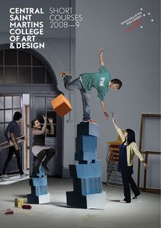
I really like these interactive, playful posters designed by Chrissie Macdonald for the Central Saint Martins College of Art and Design for their 2008-9 short courses prospectus and poster imagery (found in 'Tangible: High touch visuals by gestalten publications').

A really creative and energetic photographic set-up sets the scene and presents the mood of the college and it's educational outlook brilliantly- as a lively, fun, and sensationally creative place to be. This would undoubtedly be really engaging to their target audience, young creatives, fuelled by their imaginations and visionary aspirations.

This would work very effectively as a large scale (A1+) poster- with clear and bold logo and typographical information at the top of the poster for recognition (just above eye-level), and the bright engaging image below to absorb you, and communicate effectively in the first place.

A fun, creative design for what aims (if not infact is!) a fun, and creative institute of design.

Wednesday 30 March 2011

What Is Graphic Design For?: Type- Alex Trochut for The Rolling Stones.


I first came across Alex Trochut's wonderful, and diverse typographic and illustrative design work from Tashen's 'Illustration Now! 3' book publication. 

Alex Trochut is undoubtely one of my favourite typographers- his style so diverse and varied, he shows brilliant communication and traslation of themes through a variety of client-based design, including The Guardian's G2 supplement, British Airways, and The Rolling Stones (their vinyl cover, designed by Trochut, pictured above).

The aforementioned vinyl cover particularly caught my eye- as a natural magpie for bold, metallic designs such as this. The cover typeface looking truly desirable and tactile- almost urging you to go and touch the smooth curves of the gold- a truly luxurious and engaging design with a great consistency for the intricate oriagami fold of the CD edition, and the LP vinyl slip covers.

A really bold and classy design, this visually works so well as a clear message that this vinyl, this music is of "golden" quality- it doesn't need excessive flourish and garish design, it stands alone. 

A wonderful typographic design which reflects the band and the product greatly.

What Is Graphic Design For?: Type and Image.


"Graphic Design is the intersection point between art and communication"- Philippe Appeloig

Brilliant typographic 'Celebrating the Poster' poster design by Philippe Appeloig advertising a group exhibition, featured in Taschen's 'Graphic Design Now' book (2005).

I really like the simplicity of this image and how strongly it translates through both of the type and image elements of the design. 

I feel that perhaps why I am so fond of this bold, geometric style is because of how easily it translates en masse- a style for everyone, young and old to respond to- with bold colours popping out against the grey background this design, I believe, would be eye-catching to anybody.

For an exhibition, I feel that this design is a truly great advertisement- representing all that the show has to offer- bold, attention-grabing and visually punchy- all that poster design should be.

What Is Graphic Design For?: Type and Image- Mark Dickson.


Sourced from another great read, Taschen's 'Illustration Now! 3' I discovered the work of Leeds Metropolitan graduate, Mark Dickson, who combines various mediums and materials including watercolours, spray paints, inks, and editing in adobe photoshop. 

I have found Mark's blending of methods and techniques really inspiring- a practice which I myself was quite fond of in college, but through discovering new software methods and techniques haven't necessarily considered to the same extent whilst at university (I'm working on this!). 

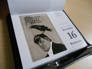
I particularly liked the 'Secret life of a manic depressive' Stephen Fry print he created, printed in Taschen's book, and later on their year calendar (see pictures above)- translating well on both, and I presume many other print mediums.

I really like Dickson's contemporary, minimal style which somehow blends into completely accuracy and life-like appearance in his portraits- he also uses tones brilliantly; using only black and white to create such a variety of shades and light within this piece.

Great visual communication and representation with imagery in this piece- the raven symbolising the death and melancholy that is notoriously known to overshadow the manic depressive's life- along with expressive, and scratchy lettering in the hand-drawn typeface above.

What Is Graphic Design For?: Type and Image (Yulia Brodskaya).


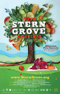
From recently recieving the greatly-anticipated present of 'papercraft: design with art and paper' (gestalten) for a birthday present, I was fortunate enough to discover the talents of papercrafts and quilling artist, Yulia Brodskaya.

Yulia combines training in oragami, fine art and textiles with typographic formations to create bold, striking and refreshingly organic graphic design pieces- with an impressive portfolio- her clients ranging from Nokia to Hermes. 
Yulia's work, to me, is so impressive as it's so vibrant and expressive in terms of communication- her style is incredibly distinctive- bright, colourful, and, as aforementioned, refreshing organic. Whenever I look at Yulia's work, as a designer, it's really inspiring to almost remind myself that I don't need to be sat at a computer all day to create great design- that hand-rendering design can be just, if not more, effective- dependent on the brief and client's demands, of course.

Generally, I believe that Yulia's work is created in a reasonably minimal scale- usually, for client based work, being used in magazines or poster advertisement campaigns- however, it would easily translate as effectively on a largely scale- for a billboard, and on screen when photographed also.

Though, what is undoubtedly clear about Yulia's work is the life and joy that it expresses- her audience therefore being very wide- her style translates to numerous products and companies- but always brings happiness and vitality to an image- utterly exuberant.

Sunday 27 March 2011

InDesign Workshop Brief: Researching magazine layouts.


Starting to research DPS layouts in magazines for inspiration and developing thumbnail sketches for the InDesign workshop brief project. Here, a selection of printed and online media from a range of magazine sources...

Topshop 214 supplement magazine S/S '11

Very fashion-focused the Topshop supplement magazine showcases wonderful fashion photography throughout. From talking to Beth, and getting to know her through the past year, aswell as her work, I certainly think that a more image- focused layout would suit her style of work- bold, bright and charming. I will do my best to showcase her varied and skillful work in the best way I possibly can.

Topshop 214 supplement magazine S/S '11

Another example from the Topshop supplement magazine- however, this time a little more text is introduced. In this image, I like the way that the photograph is stretched over the entire DPS- it really makes a statement and draws your attention in- curiousity alone leading you on to read the text or information in addition to it. Definately a layout and style to consider- it would certainly make an impact. 

Topshop 214 supplement magazine S/S '11

Just my type of design- this is bold, punchy and clear and combines type and image more to the extent I would hope to in my designs for Beth. I like the idea of having one of the two pages completely dedicated to either type or image- yet keeping them interlinked through colour, style of typeface chosen, etc. Perhaps I could create my own typeface? Could possibly use as a header or title bar to reflect Beth's work and personality to an even greater extent. 

Topshop 214 supplement magazine S/S '11

Another interesting layout from the Topshop supplement magazine- Intresting structure and balance of the photographs of the clothes along with the main bulk of text at the bottom. Interesting collage of the photograph at the back also, potentially an experimentation point.

ShortList magazine, Issue 167, 17 March 2011.

I really like this layout design by ShortList magazine- really simple but effective. Keeping it classy and cool with minimal colours- monochrome with a bold splash of read and key quotes in bold Bebas Neue typeface maintaing the edgy and punchy look. Good cut away style with solid and defined griding structure- definately more of the style I'm going for- keeping and maintaining an order but with a little bit of flare- particularly in the way colour and image are used and manipulated.

Stylist Magazine, Issue 69, 16 March 2011

Again- great bold style, bright and eye-catching (colour and image have so much to answer for!). I really like the structure of this double page spread- where the neatly aligned text box doesn't detract from the main focus and feature of the image- a style direction which is a necessity for advertising the best of Beth's design.

Stylist Magazine, Issue 69, 16 March 2011

Interesting layout here- slightly more abstract than what I would normally have chosen, with lots of conflicting context- yet it all seems to work quite well together. Interesting layout of the photographic images- looking almost scrap book like and very personal, not too formal a design- also with random, bright colours often breaking out from the greys and blacks to good effect.

Stylist Magazine, Issue 69, 16 March 2011

Really like the grid-like use of the stamp pictures here and the colours used- matching many of the key elements and blocks of colour throughout the layout and on the photographic images- fitting typeface also, a classic and formal style- very appropraite to the content. 

Oh Comely magazine, Issue 5, March/April 2011

From Oh Comely, my favourite magazine (for photography, arts, design, lifestyle, baking- just brilliant! http://www.ohcomely.co.uk) showcases fresh, clean cut and innovative layouts and grid methods without being too extravagant and de-constructed. The page layout here, advertising and interviewing the blog 'http://birdsinhats.blogspot.com' with a neatly left-aligned text and portrait section on the right hand side of the page, with the image spread over the DPS though aligned to the center- really showcasing the artwork in the best way possible, and against a bright white backdrop which ensures the images are bright and eye-catching to the maximum. Great design.


Oh Comely magazine, Issue 5, March/April 2011

A similar story with this Oh Comely layout- keeping it fresh and clean with an emphasis on the white negative space around the images, drawing you in even more. The magazine constantly uses varying colours to act as a highlighting tool through it's pages- and a great example here of the sea foam blue typeface on the right side of the DPS emphasising the aquatic, natural colours of the left. Small changes and tweaks like these make a big difference.
 
Oh Comely magazine, Issue 5, March/April 2011

Again, more great design and layout (I really can't get enough of this magazine, incase you haven't already guessed)- I like the balance of the type and image over the two pages through centralising the content in the middle of the pages, making each page look equal- again, great use of negative space. I will really play around with this in my own designs to see what sort of aesthetic it will create in combination with the words and images I use from Beth's own designs.

Oh Comely magazine, Issue 5, March/April 2011

Alternately for Oh Comely magazine- with text heavy articles they often make great use of framing with images- as shown here, a good consistency and sizing of the photographs for a clear and "blocky" DPS- though clear and easily read, I think I would like to try and create a design slightly more experimental than this...though a good starting point.


Oh Comely magazine, Issue 4, Jan/February 2011

 Really like the colours (or should I say...lack of!) used here- really crisp white on white tones. Perhaps something a little more colourful and vibrant would reflect Beth's personality- though applying orange on orange or yellow on yellow (etc) could be an interesting experiment to try.

Oh Comely magazine, Issue 4, Jan/February 2011

Again, an interesting griding structure of the photographs used here- I like the fine white lines breaking up the white images and once again leaking in the white space with minimal text, keeping the layout really clean and bright.


Oh Comely magazine, Issue 4, Jan/February 2011

Interesting use of block colour here- and definately a method and aesthetic to consider to match Beth's sunny disposition. Really like the white on colour type- must remind myself to try this.


Oh Comely magazine, Issue 4, Jan/February 2011

Soft and appealing use of colour here- a light duck egg blue which works well with the white- once again, keeping a fresh and spring-like feel to the aesthetic. I will certianly consider keeping a limited colour palette when designing so as not to detract too greatly from Beth's designs and the written content also.


Interesting use of imagery here- the two quite opposing images yet keeping a balance with the model in both. Need to remind myself, despite really like particular designs and layouts not to limit myself too early as I might miss a style or form which is just right. Bare my prefered ideas in mind, but don't be afraid to be a little abstract aswell.


Absolutely love this DPS- wonderful overlay of text over the image- the type and image clearly defined over the two pages, a clearly read and aligned yet styalised block content of the text and bold, popping colours- all the elements that I have researched and really like about magazine layouts and, in particular, double page spreads. Certainly the style I hope to emulate, and will go on to produce variations of this style in my thumbnail sketches and design development.

Sheila Stephani layout design, with photography by Donovan Dennis. 

Great design- wonderful use of monochrome and greyscale tones and shades- adds a real drama to the content and aesthetic. Personally, I would make the leading a little more condensed on the type but great style- the typeface really fitting to the photographic image on the right. Again, another great example of the text and image on opposing pages working with one another- a really strong effect that is a must for me to try out.


And a brilliant design for the end of the blog post- great use of monochrome tones and shades using different weights of typefaces and centre aligning for a bold and dramatic look. This would certainly make an impression on the viewer.
What Is A Line?: Constellations- Papercuts.


Another set of wonderfully bold and creative (paper cut) design prints by monpetitfantome on www.etsy.com
with constellations including Ursa Major, Sagittarius, Geminin and Perseus all made from hole-punch designs onto black card. Really simple idea that could easily be re-produced in my experimentation phase of the design project, but really effective.


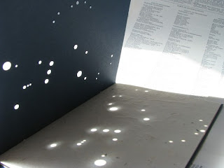
Another great papercut constellation map- using similar techniques- the hole punch effect but once more altering the size of the stars according to their visual prominence within the constellation. For me, the best thing about this design is how it's been photographed- the light coming through the card onto the white stock behind reflecting the light that radiates from the stars at night. Brilliant technique- this is a definate to experiment with.

What Is A Line?: Constellations- Illustration and Typography.


Researching my two particular favourite areas of method of delivery within graphic design- the epitome of type and image...illustration and typography...


Really clear and strongly-communicating design- I like how the constellations have been represented within the circles (reminding me of the embriodery hoops which I have researched)- almost as if you were looking through a telescope to see these stars yourself. 
Although the brief title is "What Is A Line?", what I particularly like about this design, and with constellations in general, is that your eyes naturally create the line, an automatic "dot-to-dot of the sky".

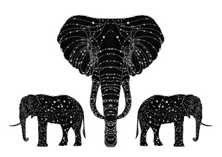
the constellation of the elephant by alexander beeching

Really creative design- making a linking sequence of constellations within another shape. Really complex looking interlinking lines and dots to represent the stars- really inventive design.


by Susan Settlemyre Williams, design by Cassandra Ellison
This poem is reproduced with permission from Many Moountains Moving Press.


Similar to what I have already been designing for my initial design stages of the project on my design practice blog (http://s-wilson1013-dp.blogspot.com) but without the lines linking the constellations together. I also like the addition of the smaller stars around the major stars (which make up the constellation)- adds a bit more interest to the image.

http://www.etsy.com/listing/57058779/when-i-die-i-shall-become-the-stars

One of my all-time favourite illustrative constellation designs created by 'monpetitfantome' on etsy (www.etsy.com) a creative use of combining langauage and imagery- ursa major being also known as 'the great bear'- a really charming and magical monochrome design.


http://store.scrapgirls.com/product/21692/

Whilst considering creating my own typeface based upon constellations, I discovered a few interesting designs along the sort of style I was imaginging- I like the "dot-to-dot like" look of this typeface, though, again, I feel it is perhaps a little too child like for my info graphics style that I am aiming to achieve in my deliverables.

http://www.csebels.com/index.php?/project/constelation-type/

I really like this typeface design- abstract and constructed well- created from a photograph of the night sky, this is a really interesting concept which could come up with a wide variety of results- definately one to try out when I have an oppurtunity to get away from the city and photograph a clear night sky!


Again, a good series of constellation- like letterforms and glyphs- though this time perhaps a little too cold and mathematical-looking, I need to find a good middle ground- perhaps working and developing my typeface from an exisiting one which suits the theme to encorporate the constellation features at a later stage.

What Is A Line?: Constellations- Screenprinted.


Whilst searching for screenprinted deliverables with the theme of constellations online- the majority of what I found was in fabric or textiles form, which has really inspired me to expand my design ideas outside of just the book or poster deliverable. These are a few of my favourite examples...

...The elusive "funky penguin" constellation...finally discovered!
I had talked with friends and group mates about originally creating a "create your own constellations" guide filled with funny or amusing animals and inanimate objects- whereas I can experiment this, I really want to push my design as a commercial commodity (sadly I can't just create everything for me!)- I will experiment with a few designs, but I think it runs a risk of potentially communicating poorly. Whilst the ironic science hipsters may realise that "the funky penguin" or "the china teapot" are not real constellations, not everyone will! (Alas!)


Good, clearly communicating constellation (orion and lyra) t-shirts in monochrome. Bold designs, though I think I would want something a little more visually complex...or, to put it in my language...snazzy.


More great "fantastical" designs (how I wish there were pigeon and bicycle constellations...!)- definately something I will play around with. I also hope that I get the oppurtunity to screnprint- not only for t-shirt or fabric design but also on paper stock. The colours you can produce with screenprinting- the vibrant metallic gold and silvers, or even glow in the dark inks would be really appropriate for my designs and would create a great hand-rendered effect- a style I believe that would be well-suited to the magical and awe-inspiring galaxies and nebule in which our constellations live.