
Typography that has inspired me, it's applications and the unique and wonderful concepts and layouts in it's application...
Print Design

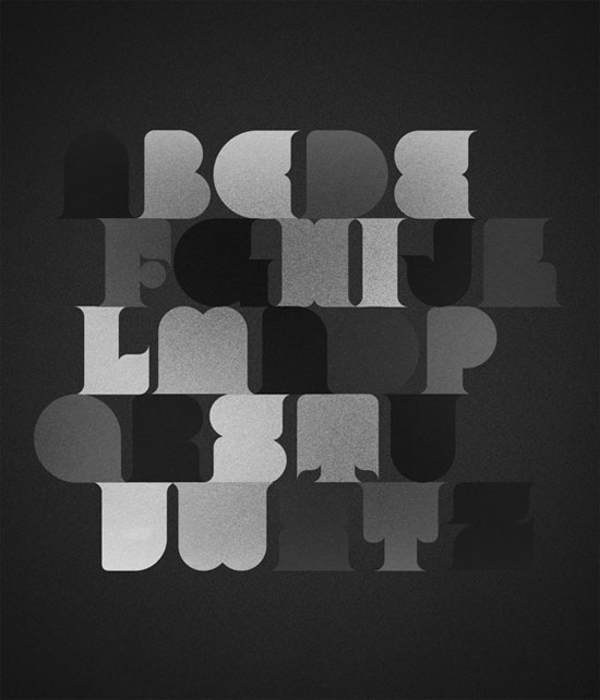
Bold and simple- really like the way that the point size has been varied to get the perfect line on the 'Q'- time consuming but definately worth the effort required for the final result.
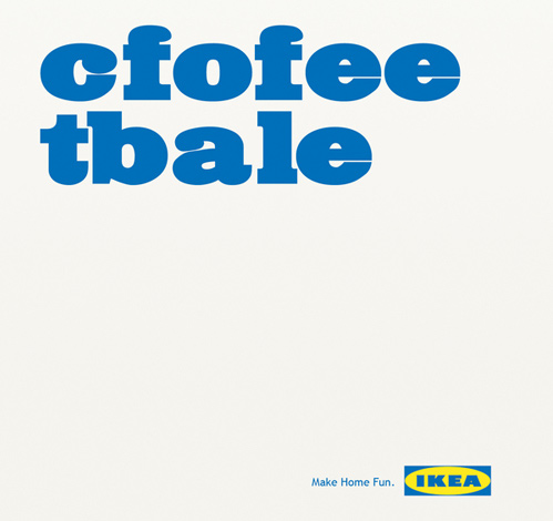
Here, Ikea's design team play upon a fun concept that was introduced to myself by tutor, Fred- that if you have both the first and last letters of a word the same, then people recognise the word as we read the shape and letterform, and not the letters themselves.
A great example here, playful and subtle.
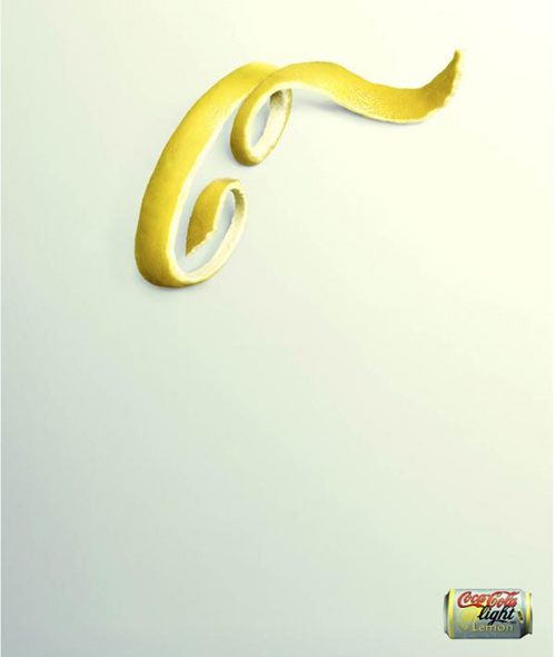
Great advertisment for coca-cola light with lemon- because of such strong branding power, so lightly is needed on the poster, yet it communicates instantly. Great use of 3D-object photography too, refreshing to see other methods and techniques used in a very digitally-heavy industry.

Really getting into 3-D typography lately- sadly the time constraints of this project have divereted ambitions to truly experiment in this style but works such as these keep me really inspired- great use of textures and colour- the white really pops against the blue background. Hopefully, I will get the chance to experiment with this method in the near future.
Typography in Advertising

Ben and Jerry's absolutely awe-inspiring use of typography as an instillation for a photography shoot- absolutely love this. I love the blend of colours to reflect the ice cream, the shaping and the layers of the typeface-scrumptious.

I can never resist a bit of tongue-in-cheek advertising- great tagline to make people instantly at ease with the product, and memorable.
Strong communication using the style of the sauce as the type- making the audience familiar even before purchase.
Great interactivity on this design- a style and form of which I have been familiar with and used in previous projects- again, very simple but bold and effective- a style I aspire to.
I read love the 3D effect applied to the type and image in these posters (above and below) making them look almost like letter press stamps (must try this!)- i also really like the soft use of colours- the bold effect and motion of the type does the talking, and leaves the colours subtle.


I really like the perspective of this photograph- it seems to capture all angles- also, a good mixture of white, black and blue. I feel that black can so often dull vibrant blues, so the white used as a "stock" on the atomic structure model balances it well, and keeps the design looking fresh and bright.

Another really simple design- clearly, in my world- the simpler and bolder, the better!
I really love seeing how simply a word or phrase can be transformed- i'm really interested in wordplay, so need to start experimenting with de-constructing and dissecting text and words a lot more.
Also, great composition of this photo- really clean cut.
Typographic Art

Lately, I have seen so many hand-painted typographic photographs, I feel truly inspired- I love the way that the shapes of the letterforms and determined and manipulated by the contours of the face- now, to find a willing victim...

Again, quilling is a practice I've been seeing a lot of recently, as I've been delving deeper into the realms of papercrafts and hand-crafted typographic forms. I love the really organic yet profession look in the designs- each unique, and crafted with a loving feel. I love the colours in this design too- really warm and sensual- communicating love very effectively.
...And something quite different! I find myself fluctuating between favourite styles- somedays loving bright, bold colours- and others, loving greyscale and monochome- I just love the variations of tones in this piece (there's nowhere to hide with black and white!) and great textures on the stock- making the typeface look quite grainy and film-like.
Typography in Packaging

Another great example of type as image- I love the colour consistency and style of each of these individual packages- each their own seperate design, but clearly the same style and branding. I also really like the organic and flowing typeface that they have used throughout.
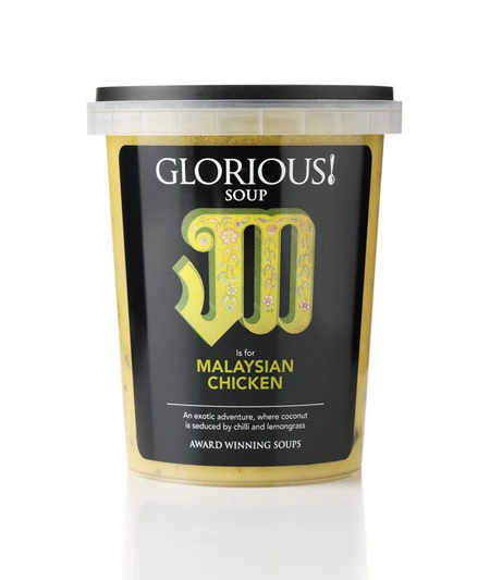
I've always been drawn to the Glorious soup food packaging designs- the illustrative style consistenyly communicates the soup inside- the flavours, the recipe's country of origin, a really bold and sophisticated style just focusing on the one letter upon the monochrome sticker.

A really usual style- but bold and sophisticated. I really like the flocked/velveteen effect of the label- a sniff away from kitsch, but in really sophisticated monochrome tones, and a hint of luxuriousness with the hints of gold- great use of gold on the bottle top too- it would really help the bottle to stand out on the shelf- very bold.
Typography in Web Design

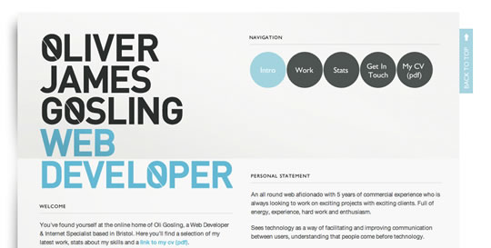
I really like the letterhead style format of this web page- i like the blend of typeface styles too- something that I try and emulate in my own work- a blend of classic serif fonts, with it's italic counterpart, and then a simple, bold, and clear sans serif font, each in a variant of point sizes.
Also, a good use of colours- distilling from black to decreased opacities to a light, slate blue.
Similar to the style above, I really like the blue and payne's grey colour pallete- and the very clean-cut structure- allowing the design to speak volumes whilst the text-based content is legible and readible.
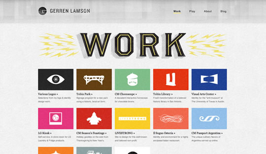
Great combination of rainbow bright colours- creating a child-like and playful style which works well in combination to the simple, vectored images and playful header title with lighting bolt flashes- happiness on a page.
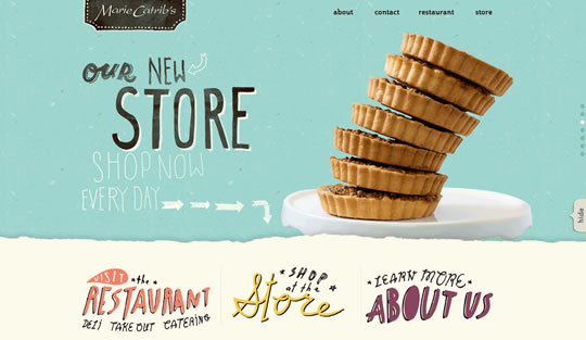
I really love the hand-rendered typography in combination with the photography here- Great combo of styles combined to make a style which is really quirky and distinctive of the designer- must practice with designing more hand-drawn typefaces!
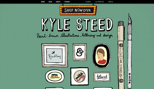
Another great use of hand-rendered design with modern, digital application. Also, a really great layout and composition- centrally aligned and sqaured-off- clear and legible for a variety of different screen sizes- and good use of organic, homely colours.
No comments:
Post a Comment