
Searching online for graphic design based upon the theme of lies for our current 'Communication is a Virus' group project brief...
It was surprisingly difficult to find design based upon this theme, searching under various titles such as 'how to lie', 'graphic design: lies' 'lie themed design', etc...but generally came up with a wide variety of "self-help" books and film posters. Typography was certainly the most commonly used method of delivery in this subject, so I have posted a few that I samples that I found interesting...

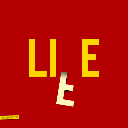
Bold message- good visual communication and strong blend of opacities and the brightness of the red symbolising danger or a warning. Clever demonstration of the construction of words in design- words hidden within other words.
Nice encorporation of methods- photographic and typographic. Clever positioning and composition.
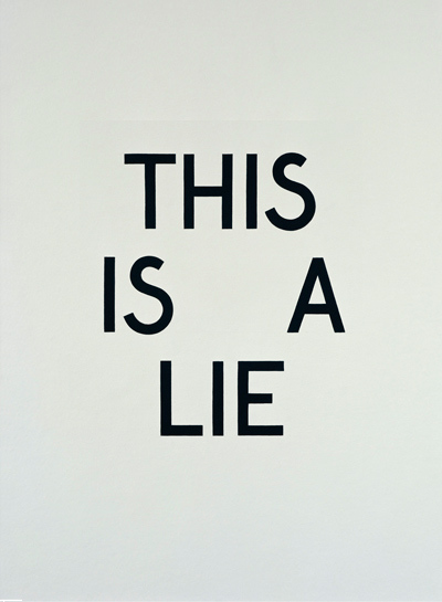
Not too sure about what this poster is trying to visually communicate, but it's certainly bold and I'm really fond of the typeface- bold without being too overpowering (quite like a lie itself!).
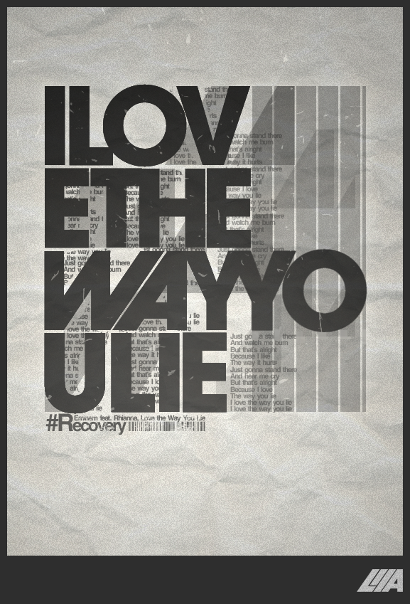
Less love for the Rhianna quote, but more love for the textures and layers used in this piece- somehow blending both the hand crafted and digital elements so effortlessly. I also really like the overlays here- decreasing the opacity in varying strips along the design. So much going on here- really inspiring methods to potentially explore.

Lieing is a part of life- again, a simple but creative design. I really like the motion in this piece- the 'F' looking quite three-dimensional, enhanced by the shadowing on the right-hand side.
So many inspiring methods and design- so little time!

I really like the pattern of this design, but it is admittedly quite unreadable- as it states on the website it's posted on, without being given the title, it would take far longer than a poster should to communicate it's written message.
Despite this, it's a refreshing example and reminder of how pattern and shape can be encorporated, and manipulated successfully into letterforms.

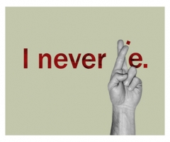
Perhaps my favourite design- I love the combination of typography with photographic portraiture in this design- also, a good contrast with the light and dark images, keeping it balanced with tones and shades, as well as the representation of the opposing genders of male and female. Really crisp images- bold and easily read. Great stuff.
I really look forward to putting these designs and concepts through to my group- and how we can apply them to our product (or solution) either alone or combined with image- bold and simple designs which we could really play upon and develop for our own practice.
No comments:
Post a Comment