
From beginning to develop ideas about layout and features on my indesign DSP article about Beth, I think that a hand-rendered typographic headline or title would be really appropraite to the style I foresee, and would really express both Beth's style and character- playful, expressive, and unqiue.
Here, I have blogged a few specific artist's designs and techniques that have inspired me, and how I may go on to apply their methods into my own practice...

I really like the builk of Gemma Correll's illustrative work- loud and proud- each individual letterform has a personality and character- seen more as individual pieces than a set perhaps? Applying this style really would be dependent upon the characters in my word, etc- an illustrative-heavy style would work better with fewer characters for full impact.

Another of Gemma's illustrative typographic designs- good combination of colours (restricted to a limited palette) and good communication of the meaning of history of the word in it's style and form.
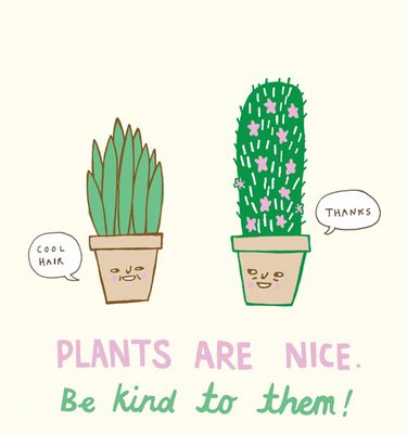
Again, Gemma blends colours nicely- this time keeping to a pastel-like pallette of pink and green (one of my personal favourite colour combos!)- and a good mix of serif and sans serif typefaces- where the san serif is kept bold and clearly- acting as the bold hierarchical content.

Another great design from Gemma Correll- this time combining the letterform of an ampersand with the restrictions of three colours plus stock palette, and illustration- cleverly giving the illusion of line with her designs without using a continous one- a much fresher, cleaner designer, contemporary and fun.
Again, I think Kate Sutton's work is a great example of really expressionate hand-drawn type. The textures and variations of typeface styles really help to express the phrase or sentance and personifies it a lot more- giving a sense of the character stating the phrase, as well as the character of the phrase itself.
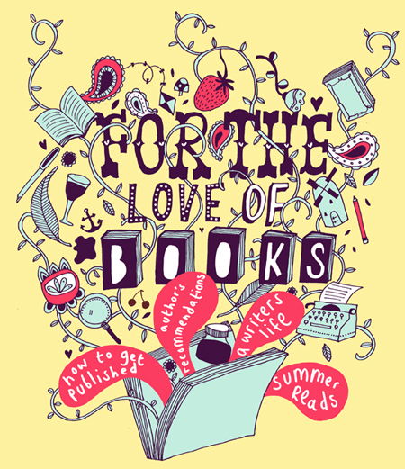
Great use of illustration housing the typography in the books, and I really like the reversing-out colouring of the type in the speech bubbles- the dense area of pink really pops out against the pale yellow background, and instantly draws you attention in to important, snappy details.
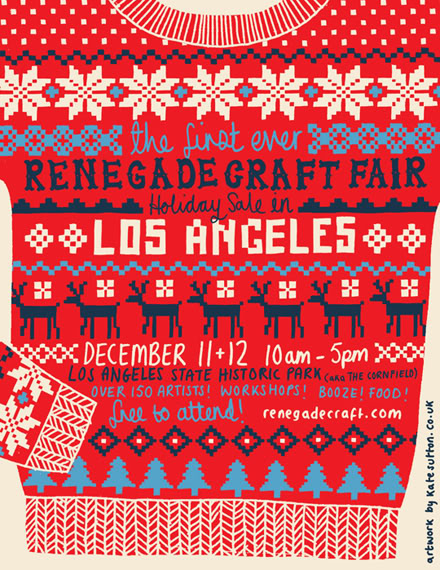
Again, great design in regards to visual communication from Kate Sutton- this style perfectly suited for the fairisle festive jumper style.

http://grainedit.com/2007/12/19/damien-corell/
I really love the texture used here in Damien Correll's (no relation to Gemma...) typographic piece- not only in his illustration but also in his scanned images- there are so many inspiring stocks and methods- now I've just got to experiment with them all!
I also quite like his use of black and white here- not what you would automatically connote and communicate with nature and wildlife- but a really bold choice which stops the piece from becoming too "once upon a time.." and child-like.

http://naomiabel.com/898531/Part-Parcel
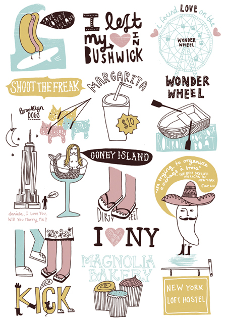
Great use of colour and layout in this collaboration, featuring some of Damien Correll's work- bold, punchy and to-the-point- they would make clear posters and the hand-rendered styles keep them from looking too samey or bland.

http://www.pomegranita.com/2006/10/si-scott/
I have been a fan of Si Scott's awe-inspiring (and often unbeliveably so!) handrawn typographic and illustrative pieces. When I was originally invasaging the type I hoped to use for Beth's InDesign page, I imagined something quite similar to his designs- very organic, yet contemporary with free flowing lines and expressionism.

http://www.dirtymouse.co.uk/illustration/si-scott/
I think a style like this would be great for Beth- perhaps a little less intricate in regards to the finer dots and bubble-like areas, though the colour and boldness of the typeface is exactly what I imagined- I love the gradient of the darker saffron colours to the sunshine yellow from left to right- a really fresh and vibrant design.
http://2.bp.blogspot.com/_kVXjcCZQMsY/TIb6pTv8vzI/AAAAAAAADfs/vRqDfxMpxkc/s1600/kleiner.jpg
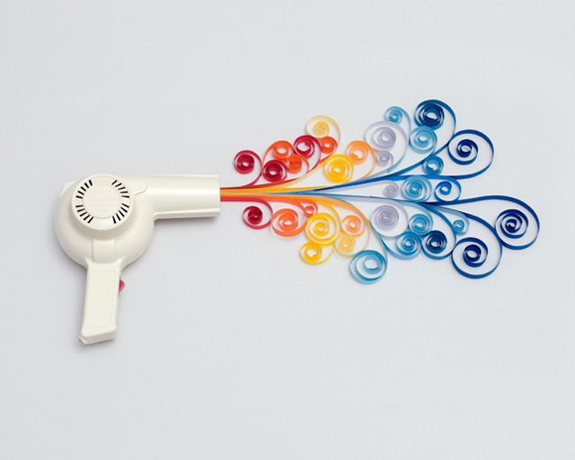
Recently, from pouring over typography and papercraft books, I have becoming really fascinated by the art of quilling, and the bold, intricate designs the arrangements can create.
The piece above really made me laugh- such a great installation piece- and I love the rainbow bright colours. I know, to express Beth's personality the page will be splashed with bright, sunshine colours- reflecting her attitude- one of the most positive and uplifting mindsets I have ever met in a person.
http://leekottner.typepad.com/.a/6a00d8341c757c53ef01053691c792970c-800wi
Another great piece- this time encorporating type into the design- I love the warm colours and the way the artist has combined and mixed up the ratio of negative space and decorative fills.

http://cdnimg.visualizeus.com/thumbs/08/12/03/design,illustration,inspiration,quilling,typography-3f183a577d28030710acab453bc8f182_m.jpg
This piece really interested me- so unique using the white-on-white palette- definately one to experiment with (dependent on the colour of my stock/background for the DPS?)

http://c0573862.cdn.cloudfiles.rackspacecloud.com/1/1/46023/920899/Picture%203.png
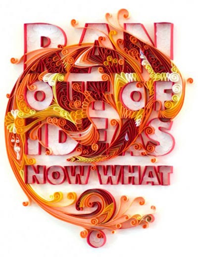
This piece says it all- fun, loud, bold and creative- all the elements that I want my design to be!
In regards to time, a quilling piece may be difficult, therefore, I am going to start by using a vector-based design, and time permitting, will go on to experiment with the quilling method and technique, if it feels necessary at the later stages of my development.
No comments:
Post a Comment