Researching my two particular favourite areas of method of delivery within graphic design- the epitome of type and image...illustration and typography...
Really clear and strongly-communicating design- I like how the constellations have been represented within the circles (reminding me of the embriodery hoops which I have researched)- almost as if you were looking through a telescope to see these stars yourself.
Although the brief title is "What Is A Line?", what I particularly like about this design, and with constellations in general, is that your eyes naturally create the line, an automatic "dot-to-dot of the sky".
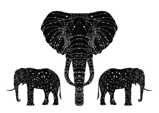
the constellation of the elephant by alexander beeching
Really creative design- making a linking sequence of constellations within another shape. Really complex looking interlinking lines and dots to represent the stars- really inventive design.
Really creative design- making a linking sequence of constellations within another shape. Really complex looking interlinking lines and dots to represent the stars- really inventive design.
by Susan Settlemyre Williams, design by Cassandra Ellison
This poem is reproduced with permission from Many Moountains Moving Press.
Similar to what I have already been designing for my initial design stages of the project on my design practice blog (http://s-wilson1013-dp.blogspot.com) but without the lines linking the constellations together. I also like the addition of the smaller stars around the major stars (which make up the constellation)- adds a bit more interest to the image.
http://www.etsy.com/listing/57058779/when-i-die-i-shall-become-the-stars
One of my all-time favourite illustrative constellation designs created by 'monpetitfantome' on etsy (www.etsy.com) a creative use of combining langauage and imagery- ursa major being also known as 'the great bear'- a really charming and magical monochrome design.
One of my all-time favourite illustrative constellation designs created by 'monpetitfantome' on etsy (www.etsy.com) a creative use of combining langauage and imagery- ursa major being also known as 'the great bear'- a really charming and magical monochrome design.
http://store.scrapgirls.com/product/21692/
Whilst considering creating my own typeface based upon constellations, I discovered a few interesting designs along the sort of style I was imaginging- I like the "dot-to-dot like" look of this typeface, though, again, I feel it is perhaps a little too child like for my info graphics style that I am aiming to achieve in my deliverables.
Whilst considering creating my own typeface based upon constellations, I discovered a few interesting designs along the sort of style I was imaginging- I like the "dot-to-dot like" look of this typeface, though, again, I feel it is perhaps a little too child like for my info graphics style that I am aiming to achieve in my deliverables.
http://www.csebels.com/index.php?/project/constelation-type/
I really like this typeface design- abstract and constructed well- created from a photograph of the night sky, this is a really interesting concept which could come up with a wide variety of results- definately one to try out when I have an oppurtunity to get away from the city and photograph a clear night sky!
I really like this typeface design- abstract and constructed well- created from a photograph of the night sky, this is a really interesting concept which could come up with a wide variety of results- definately one to try out when I have an oppurtunity to get away from the city and photograph a clear night sky!
Again, a good series of constellation- like letterforms and glyphs- though this time perhaps a little too cold and mathematical-looking, I need to find a good middle ground- perhaps working and developing my typeface from an exisiting one which suits the theme to encorporate the constellation features at a later stage.


Thank you for featuring my work on your blog, you can see and read more about this project on my website: http://cargocollective.com/cassandraellison/#1762944/Constellations-Broadside
ReplyDelete<3 Cassandra
Great to hear from you Cassandra!
ReplyDeleteThank you for the brilliant inspiration and beautiful work! I'll be sure to follow your future projects! :]
Sophie