Researching and sourcing examples of Exhibition posters for potential inspiration in the development of printed media in my Print production design developments.
London South Central's 'The Shape of Things to Come' displayed architectural works- easily and visually represented by the black silhouette shapes against the bright, eye-catching yellow background. The vibrant colour works well, adding interest and vibrancy to an otherwise very minimal design. Unique composition too- suggests a playful creativity.
The National Portrait Gallery's retrospective exhibition of the portraiture photography of Mario Testino was easily communicated through the exhibition's promotional poster. The background image is of his (perhaps) most famous model and associate, Kate Moss.
The simple white and grey uppercase type works well over the more vibrant blues and reds- though the typeface still insists a bold impression.
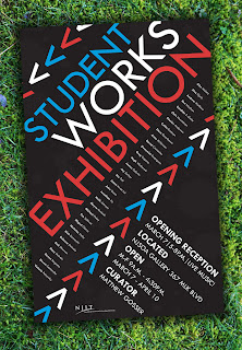
An exhibition poster promoting the showcase event at the New Jersey Institute of Technology.
Really like this poster design- interesting, modern compositions, creative use of arrow symbols and well-balanced use of colour. Eye-catching, and with the aforementioned various compositions, keep the eye moving around the design with ease.
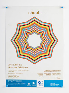
Branding promotional work by designer Neil Lawler for the Amnesty International sponsored exhibition 'Shout', held at the Cornwall College 2011 Arts & Media Summer Exhibition. Visually dynamic, yet simple with a strong use of colour that certainly attracts attention. Simple and stylish.
Curated by Rafi Ghanaghounian. The bold, "in your face" condensed bold typeface works wonderfully with Kern's abstract portraiture in this exhibition poster. Loud and impactful- this poster is brilliantly bold.
A creative design project by Turkish Designer,
Mehmet Gozetlik, in which he creates promotional typographic film posters which also incorporates the brand integration within the films into the design- an insightful and sophisticated, minimal design.


No comments:
Post a Comment