For the printed packaging and design outcomes/deliverables for the YCN/Graze brief, Charlie and I have been considering the methods of production that would be most suited to the company and their environmental ethos and outlook. We both agreed that Screen printing would be a great option- from a cost point of view, as well as print production and overall visual outcome- achieving a natural, more organic look than they currently have, and started researching a few existing examples of screen printed design.
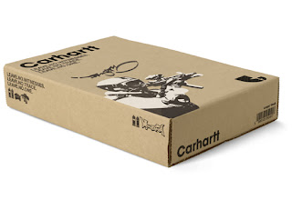
http://idiwa.net/assets/images/carhartt/carhartt_box_shot.jpg
A similar dimension/scale and colouring of the stock material to the Graze box, this is the sort of visual outcome that we could achieve within our own designs- keeping the branding consistent, and the print reasonably minimal. This would ensure that the formality was kept in the office environment that we hope to promote our product in, yet still being eye-catching and visually communicating the natural/wholesomeness of the product itself.
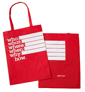
http://www.septemberindustry.co.uk/images/gettyproud.jpg
Reversed out white inks on colour, in my opinion, look great in screen print. This would work really well if we were to follow a current design idea to flood print the inside of our boxes green, and print the nutritional information of the contents in white on the inside- certainly bold and vibrant, yet, again, still being consistent to the minimal vecotr-based style of the branding and colour palette that we now hope to achieve to sit well within the office and workplace environment(s).
Again- more great reversed out print on brown paper stock (quite interesting use of stitch on the paper too!)- great mix of typefaces and simple, vector illustrative details- this is far more appropriate to the design outcome that we're hoping to achieve, just with a little more character and playfulness!


No comments:
Post a Comment