WEBSITE CONTEXTUALISATION
Dreamweaver research
Finding as many examples of websites that inspire my potential website design(s), making notes of what's effective- design details, etc.
Looking most specifically at design-orientated websites as they, after all, are part of the industry that I myself work in, and aspire to be as good as. Some wonderful examples below, with short explanations as to the factors that I like about each of them.
http://www.joyengine.com/
Really clean, crisp, minimal and simple- this site for JoyEngine is really easy to navigate and understand. Perhaps not as eye-catching as I would hope to go for myself, but definitely along the right lines in terms of the layout and minimalism- very European (which, coincidentally, is very "my taste").
http://www.heredesign.co.uk/
Love this website design by Graphic Design company 'here'- unusual for me perhaps as I tend to be very anti horizontal page navigation, but here, it really works well.
Text is kept to a minimum, clear, and easy to navigate- here, the images and design work speak for themselves- just what I hope to achieve in my own designs.
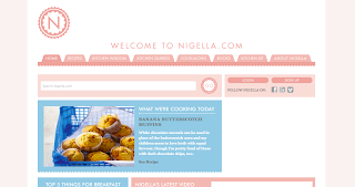
http://www.nigella.com/
Sweet, simple and ever-so feminine! This design for Nigella Lawson (celebrity TV chef) is charmingly bright and girlie in an easy to navigate and simple pastel-based coloured site. Perhaps a little too much going on for me in terms of the colour and decorative side, personally preferring something a little more punchy and minimal. However, in this context, the design works wonderfully, and is a truly memorable, and beautifully contemporary design which visually communicates the "brand" of Nigella perfectly.
http://weareallconnect.com/
Really bold, simple and minimal. Just my cup of tea! I like the organisation of the images to the right of the page in a vertical navigation which are easy to view, and are well balanced in terms of digital/print and colour/monochrome- coloured design projects.
Personally, the only thing I would look to change is the text below their logo- and would ensure that it was kept more consistent with the style of the page. The serif typeface looks a little unusual with the crisp, geometric type and gridded format of the images.
A really clean, simple layout with slightly additions of colour to the logo which work well in balance with the colour photography (balancing both the left and right sides of the page). Again, keeping it really simple to let the design do the talking- just as it should.
http://www.imagenow.ie/
Really like the style of this website design homepage for an image driven design company. Something a bit different about having the photograph on the homepage which adds interest to an otherwise very minimal page. The style of the image and direction of the blur (through extended exposure) also helps to ensure a balance is kept between the text content on the left hand side (the navigation bar) and the right of the page.
http://ollymoss.com/
Having looked at the design in a previous Dreamweaver session, Olly Moss' website is the minimalist's dream. Really clean and simple, the homepage is very ambiguous, yet has the added interested of the illustrative type design for the logo. When buttons on the navigation bar are clicked, it directs onto further content, including his bright array of portfolio images.
Instantly attracted to this due to the branding and consistency of the style by the design company (I am particularly partial to yellow, being my favourite colour, and one that I use in my own branding design), with the yellow banner being a particularly eye-catching piece.
Perhaps a little bit too much going on on the page for my liking, though I really like the structure and gridding of the website, along with the horizontal navigation bar which is easy to understand and manoeuvre.
Particularly like the reversed out effect on this website, which gives a great variation from the more usual bright white flooded background which is so commonly used on design websites and online portfolio sources. Here, the bright portfolio design images on the black act as a sort of lightbox, and make them even more eye-catching and bright in contrast with the text and navigation bar.
I really like the typographically-led, editorial style of this website design, with an almost grid-like structure in the background giving evidence to a more typographically driven designer and design portfolio. The red also works well as a high-impact and eye catching colour choice, whilst still looking quite mature and "sophisticated".
Perhaps a little too typographic/editorial to reflect my own design portfolio, but a big fan of this style, nevertheless. Really well considered and formatted layout design.
Run by Cargo (a free website building programme that is very commonly used by student designers, in particular) this website has a crisp, minimal and clean layout that really appeals to my own tastes and website design aspirations. I really like the clearly gridded and structured portfolio files that adhere to the same size, format and composition to ensure design consistency is kept most effectively.
For me, the only things that I would particularly change is keeping more of a balance between colours/monochrome photographs/design projects in the portfolio and to have a left-hand-side navigation bar, which I think would tie the page together more effectively, and in a slightly more structured way.
Really like the faded opacity effect on this background as you enter the homepage before playing the game- tying in the content of the website effectively whilst still drawing your attention to the typeconnection homepage 'PLAY' symbol. The bright, acidic green colour also ensures that the website looks contemporary and stylish.
I really like the crisp, minimal and clean style of this website which uses white space to it's complete advantage (something that I aspire to do and keep practicing in my work to achieve a really minimal and sophisticated design outcome, reflective of my own personal taste- influenced largely by Swiss Graphic Design). The photograph on the homepage helps to add interest, and gives insight into the work space and overall design portfolio/personality of the designer(s).
I love this bright, eye-catching design from design studio 'Eight Hour Day', which wonderfully showcases some of their outcomes from their portfolio, whilst still ensure that their personal brand and identity is kept consistent and evidenced throughout.
Really crisp, cool and unique website from hinterland studio designers (their branding which reminds me a little of Norway's 'Heydays' design studio!) which combines bold, photographic imagery with considered editorial- esque layout and design- interesting use of the reversed out navigation bar at the top... something I've certainly never seen before!
Completely fell in love with the site for watch manufacturers and retailers 'UniformWares' (almost as much as I did their watches!) the minimal layout, strong consideration for type and branding, as well as their stunningly high definition, detailed photograph help to ensure that the website looks completely clean, contemporary and high end- exactly what I want to achieve with my own website designs.


No comments:
Post a Comment