http://lovelypackage.com
Having gone on to specify the name of my honey brand, 'Freebees', due to the nature of the not-for-profit concept of the brand (where all profits go to the conservation of honey bees within the United Kingdom), and also looking at a high-end market, focusing on middle class retail shoppers, for the product to not look out of place in store at Waitrose or specialist food suppliers such as Selfridges and Harrods, focusing on creating a really luxurious and high-end product.
All sourced from the packaging site, lovely package (see link above) these are the sort of designs that I am aspiring, myself, to create, with written descriptions as shown below.
My favourite is the design by Beza Project (as shown, directly below below) with it's luxurious gold foiling and stock which looks really high-end and beautifully designed. Of course, as part of my project, I am looking to produce my packaging (and promote themes of) ethically and sustainably- so this may cause some issues in the production, but I will still aspire to achieve the best results possible.
Designed by Beza Project | Country: Poland
“Mleko i Miód” (Milk&Honey) was designed for the Ministry of Foreign Affairs as a gift for the Polish EU Presidency. It is a set for preparing a traditional drink. Our studio delivered a turn key solution – from the initial concept design to full coordination and project management at the production level. It consists of a porcelain cup, spoon and a jar of Polish honey. The shape of each element and graphic design were inspired by motifs originating from Polish culture and tradition. The mug was sculpted to resemble a traditional milk can and the spoon is shaped like a quill pen – a nod to the poetic provenance of the term “a land flowing with milk and honey”. The detailed recipe for ”Milk&Honey” can be found inside the box.”
Designed by TKTJ Design | Country: United States
“The design is based on the idea of honey being so basic, we created a chemical symbol “Bh” all for itself. The element is a pure chemical substance, that cannot be broken down in further, and by placing this honey within this realm it allows it to take on the idea of honey as purity. The packaging also seems to suggest something medicinal about the product, which is interesting considering honey has long been touted for many other things than just a sweetener.”
Designed by Tatiana Matsoulevitch | Country: United States
“The assignment was to design a package for any chosen product. This packaging concept for I ‘love’ honey was inspired by the honeycomb. The bottle can be reused as a long glass and the package as a decoration.”
“Nude Bee Honey Co.® was launched in 2010 by entrepreneurs Edward Okun and Jared Cantor with the aim of delivering the most delicious raw honeys produced by independent beekeepers.
Working with independent beekeepers to deliver varietal honeys means a constantly evolving product line. Different types of honey come in and out of stock based on their limited supply, which means all of the honeys we carry at any given time are limited edition.
Produced throughout Ontario Canada, packaged in Guelph and distributed from our small but efficient warehouse in Kensington Market – Toronto, Nude Bee Honey Co.® is changing the way people love honey.”
Designed by DEDass | Country: United Kingdom
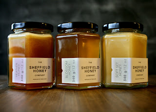
“15 minutes from the DED Studio, Sheffield bees are busy making Sheffield honey. Made in Sheffield doesn’t get more yummy than this."


No comments:
Post a Comment